http://www.consultantsbureau.org/home3.JPG
http://brandingwire.files.wordpress.com/2007/10/consulting.jpg
http://www.steelbluesolutions.com/Images/Web/Consulting1.jpg
http://images.businessweek.com/ss/08/09/0904_first_jobs/image/boston_consulting.jpg
http://www.bhconsulting.ie/consultant.jpg
http://www.boltonpartners.com/_images/images/Investment.jpg
http://bharticonsulting.com/yahoo_site_admin/assets/images/consulting.34791310.jpg
http://www.panthera-consulting.com/images/consulting.jpg
http://www.c3connect.com/assets/images/main%20images/consulting%20services.jpg
http://www.avision2market.com/consulting.jpg
I chose these images because they are of what most people thing of when you think consulting. People talking to other people, giving them advices. I don't really know what goes with consulting ._.
That's all that really comes to mind with me. Somehow using images like that and charts and graphs dynamically to create some kind of business feel but with a little bit of variety in the images.
Monday, December 13, 2010
Saturday, December 11, 2010
Project 3- Phase 3
I ditched the top nav because it was too difficult for me to too, and I didn't have time to tinker with it.


Tuesday, December 7, 2010
Podcast 15
http://boagworld.com/design/fireworks-vs-photoshop/
I thought this was interesting since I use photoshop often. I have fireworks but I don't use it. I don't know how too. I've opened it a few times to toy with it, but I didn't know what I was doing so I didn't see much need to keep messing with it. Reading this gave me a better idea what it is and what it can do. Like i knew that is was use for web design, I found that out from googling it. But I didn't know that it had so many functions similar to photoshop. From the way it sounds with the ability to have multiple pages with different layers on them, it kinda sounds like a weird cross between photohop and dreamweaver.I think some of the functions are cool, and I like that you can save fireworks files as psd, and make file wide changes from one section of the file, BUT I don't really understand that stuff too much yet. I'm not too into the technical aspect of adobe programs. I'm self taught and learn everything from tutorials and google. But overall I think if I understood the program a little better I would use it instead of having it installed just to say I have it. This article was really useful to me since I at least have a much better understanding of what it's for and what it is capable of. Maybe with more creative googling I can figure out how to make good use of it :)
I thought this was interesting since I use photoshop often. I have fireworks but I don't use it. I don't know how too. I've opened it a few times to toy with it, but I didn't know what I was doing so I didn't see much need to keep messing with it. Reading this gave me a better idea what it is and what it can do. Like i knew that is was use for web design, I found that out from googling it. But I didn't know that it had so many functions similar to photoshop. From the way it sounds with the ability to have multiple pages with different layers on them, it kinda sounds like a weird cross between photohop and dreamweaver.I think some of the functions are cool, and I like that you can save fireworks files as psd, and make file wide changes from one section of the file, BUT I don't really understand that stuff too much yet. I'm not too into the technical aspect of adobe programs. I'm self taught and learn everything from tutorials and google. But overall I think if I understood the program a little better I would use it instead of having it installed just to say I have it. This article was really useful to me since I at least have a much better understanding of what it's for and what it is capable of. Maybe with more creative googling I can figure out how to make good use of it :)
Project 2- Phase 1 redo
I'm doing a anti violence non profit. One of the first things that stuck out to me is that there are almost images of children in them. There are like images of people holding signs from event, stuff like that. I've also noticed that some of them use like a stop sign in their logo. There is usual a dark background, with a lot of red. I think that's to give some kinda of feeling of urgency. There are a few pages I've seen with light backgrounds too though. Sometimes there are images of guns, but like in that circle with the line through it meaning "no". There is usually 2 navs (top and side) and the front page is usually news and announcements. I don't know what else to really say >_<;;
Monday, December 6, 2010

Assignment 25

http://colorschemedesigner.com/#0011Tw0w0w0w0
http://colorschemedesigner.com/#0011T----zF--4w0--
My colors are red and white because those are the colors of Japan. I would use the buttom logo. I like it better because it has japanese on it and that goes with my website. The colors are the same as the japanese flag minus the black. That black is just a translation of what the characters say. The top one is the name I sign my art work with so yeah... I don't know what else to say about this assignment. I want my "brand to be very asian (japanese) inspired hence the japanese text. Plus I just think it looks cool.
Saturday, December 4, 2010
Project 3- Phase 4
HEre is what I have so far. The red is a space holder for the top banner, the blue is a space holder for a potential seo nav. I have the top portion of my compartments done. I'm still tweaking the css of the visual stuff. I didn't add the three bottom compartments yet.


Wednesday, December 1, 2010
Assignment 2
Resources:
http://www.nutter2007.com/
http://www.barackobama.com/index.php?splash=false
http://www.whitehouse.gov/
http://www.governor.state.pa.us/portal/server.pt/community/governor's_web_site/2985
http://fattah.house.gov/
My main starting point would be trying to work from what I see on the white house's website. I would try to figure out a nice simple color scheme and and effective way to stylize the nav to go with the website.
Nutters website, the only things think I could use from there is the way he has like and RSS feed from his blog and news articles about him. Obama's personal website is good because I think I would try to incorporate the same kind of use of graphics and the way his call to action button stood out. Everyone need donors. Fattah's website is something that i would use as a reference to stay away from. I think the width is too small, and I think the fact that the content doesn't have a different background from the rest of the site provides too much negative space. Rendells site, I would try to make everything compatible to every web browsers, and I like the nav and search bar. I would try to use all of those things.
Tuesday, November 30, 2010
Assignment 9
 from: www.ebay.com
This is when I ordered my new phone charge from Ebay. The visual ques I saw were things like the buy now, the prices, the time left (which in some cases gave a sense of urgency. ). I felt pretty secure using this site because I have both ebay buyers protection and the added protection of having a pay pal account. With pay pal you aren't liable for certain charges if you can prove you didn't approve them. I got three emails from this purchase. I got one from ebay letting me know I won an item. One from pay pal informing me my account was being charged. And One from my seller letting me know how to contact them if there were any issues an that my payment was received and approved. There were I think two receipts. I would use this site again. Maybe not the seller. The shipping was a little slow. I was pretty satisfied with everything. Nothing really made me question the purchase other than "is that picture what I'm gonna get or is it a lie....?" The process was simple, not so simple that you didn't have much input but simple enough that it wasn't a headache and I'm willing to do it again. The end.
Assignment 16

The background was ugly and didn't go with the site. The colors were clashing and there was no repeating theme. The Nav only had three buttons and wasn't of much use, and didn't provide much information. The banner looked weird between those too pictures so I joined them to make it look a little better. The was a contact thing in the content box, I took it out and put it on the nav because I thought it was ugly there. Those are my changes.

Monday, November 29, 2010
Assignment 23
found: http://www.secondbaptistgermantown.org/
This website is really plain and doesn't display properly in chrome. Its weird to me because it's like a regular website at the top, but then as I scroll down its more like a blog. It was a little confusing. There is WAY to much content on the index page. Like I was scrolling down for a while. The header picture is really grainy, I thought they would use a better photo. It's says they are making adjustments to the website, but I'm not sure when that update was posted. They use the same header and stuff for all the pages, so the changes in the content are subtle, like I didn't realize that i navigated to another page until I saw that the h1 text under the banner changed. They are using word press and pre-made themes so they are kinda hands off with everything I think. I don't what else to really say. It doesn't really match the church from what I remember. It was really vibrant and had a lot going on when I went (almost 4 years ago). There was always some kind of event going on, a lot of music, and the sermons were really interesting and the preaching was high energy. There was also a lot going on between the church and the community and I think they way the site is doesn't reflect that. I don't know if that's how the church is now, but that's what I remember.
Monday, November 22, 2010

Tuesday, November 16, 2010
Assignment 21
Topicana: http://colorschemedesigner.com/#0x22Pw0w0w0w0
I picked this because I saw orange and blue as the main colors on the current page. I think that the green logo would go nicely with the orange and since its a juice company I think that the colors are bright and vibrant and fit well.
Warehouse Thingy: http://colorschemedesigner.com/#3i12Pw0w0w0w0
I like this because it is a simple color, isn't to bright, or too boring. Its not to playful, and it's looks like a nice color to me. And blue is my favorite color. >_>;;
Medical People: http://colorschemedesigner.com/#3R22Pw0w0w0w0
I liked this one because it isn't that boring, and I think if used correctly it can look pretty professional. Also for some reason, when I think of scrubs, I think of a color blue.
Skate Shop: http://colorschemedesigner.com/#4e12Pw0w0w0w0
I picked this because when I think of mellow I think of wine. So I think an nice deep dark color would do good a mellow, plus it's a common color I see as an accent on skateboard gear.
Aid Non Profit: http://colorschemedesigner.com/#0011Bw0w0w0w0
RED RED RED RED. Red means stop. Red means blood. Red is dangerous, the color of choice for the red cross, RED ALERT. Red usually means something bad, serious or important. (DON'T PRESS THE RED BUTTON). So yeah, I think red and white would do good here.
Sunday, November 14, 2010
Assignment 20
www.apple.com
I think the apple website is sexy.
The Nav Bar: I like it because it's "brand specific". I think that what you called it. The nav bar looks like the it fits with any apple product or program. When you look at it, you know it's apple.
I like that the categories are broken down into simple things and that there is a search bar right there. I also like that they use the apple logo as the home button on the nav bar. There is a slight gradient on the nav bar, and I think a slight drop shadow. I think that looks good. Really good. So smooth and smexy.
Content: Well on the front page right now, there is an add for the Mac Book Air. I like they're use of this add space because it's very big, but minimalist, and it's like the first think my eye sees on the page since it's usually the biggest element. I'm a huge fan of minimalism because when done right, its uber easy to find what I'm looking for. I love it. The presentation of the add space is just well done to me because it's so simple and to the point but to me, it also look really pretty.
Rest of the page: There are a few compartmentalized elements at the bottom for the page for other products and information. I like them, I think they fit well with the minimalistic look of the page. They have quick links to the lesser talked about items like the iLife suite and Apple TV and the engraving service. Even tho most people aren't looking for that stuff, if you are one of the few who are, it's right there. It like that too.
I just noticed that there is a small news highlights bar. I thought it was tabs for the compartments at first but then I saw it was changing. I think thats pretty cool too, but a little hard to notice.
I think this is a good user interface because it uses high contrast, it's minimalistic, the site basically flows. The whole page is just clean, easy to navigate, easy to read, and aesthetically pleasing.
Podcast 11
Found: http://boagworld.com/bites/new-skills
I never thought of needing other skills to be able to design websites other than knowlege of coding and what looks good on a web page. After reading this I learned that there is more too it.
This article/ podcast says there are 5 core skills that can help you out a lot as a designer:
Knowledge of:
-Marketing
-Psychology
-Strategy
-Copyrighting
-Contextual Awareness
After reading I think it makes a lot of sense to know these things. Like you should know how to market your product so you know how to implement that in your website. The psychology makes a lot of sense since I read an article/ podcast not to long ago about how using companies use psychology to basically guide users in a way on their sites. I though that was pretty cool. Strategy makes sense because you basically have to strategies what you are going to do on your website. I know you are supposed to do a lot of planing and drawing out what you are supposed to do before you get into coding. The contextual awareness think makes sense since now a days everyone has a mobile device with internet capabilities on it (me included). So you do have to plan for how your site would look on those different mediums. Copyrighting, I didn't get so much. I mean I do, but that's more legal stuff to me. Blegh to that.
Friday, November 12, 2010

Wednesday, November 10, 2010

Monday, November 8, 2010
Assignment 18
http://www.krijtenberg.nl/
I think this website is cool and plain at the same time. I like that the it's seems pretty minimal but at the same time that makes it a little plain. I think the nav is cool since it's like business cards on the table, but there isn't much else going on. Since it's a website for a photographer I thought there would be more previlant examples of his work, instead of like that thumbnail in the corner. The alt text on the nav is good. There aren't any overstates or anything, no cool text decoration or anything like that. Thats why I think it's plain.
The portfolio page was cool but I don't think it loaded properly in my browser since I couldn't school down and the image was cut of so it didn't load right or something. Could be my browser could be a coding error?
OH! Another thing I noticed was that his nav wasn't constant. I thought that was weird.
All In all I think it's an okay site just really plain.
Sunday, November 7, 2010
Podcast 10
Found: http://boagworld.com/design/no-more-websites
This is about making posters. The process of making posters is the almost the same as making a process.
"Posters have to be:
- Visually attractive in order to grab attention.
- Easy to take in at a glance
- Provide more information to the more interested reader
In other words they need to be…
- Engaging
- Usable
- Scanable
- Have a clear information hierarchy "
The author thinks this is how you should follow these steps to create good website. After reading that I think it's true. Like You need to think of all of those things in the design process. There are some designers who specifically model their websites after a posters. I think that's a smart thing to do especially when you are working on a website that you want to pop and stuff. Or when you are worrying about the fold of a page.
I think that I can try this kind of tactic when designing a site since when I think about it makes a lot of sense.
Saturday, November 6, 2010
Project 3- Phase 1
I've looked around the internet for music download sites (mainly asian) and the majority of them are blogs. They all have navigation on the side, usually the alphabet and a search bar. Each post has a picture of the album art, track listing, date it was released, and of course a download link, with one or two mirrors. Since I'm not trying to do a blog I think I might do something just a little different. LIke have two main content things on the index. On for news, and the other for like most recent releases. I will keep the navigation and the search the same.
The header usually has a really nice banner featuring a popular artist (or artists) and the name of the blog or site. There is also a lot of time like an asian theme, be it color or like the way the graphics are. I want to use an asian them, but it be like red and white for the most part. I'm not too sure about that.
There is usually partner banners on the side for sister/ partner sites advertisements, along with the disclaimer to avoid legal troubles. Some sites have a link to actually BUY the music, but I don't think I'll have that.
I've also notice a lot of these kinds of site have news on various artists personal lives. Things like what movie they are in, family stuff, or what anime their song is used in. There are also usually links to PV music videos when they are released.
I want to incorporate all of these things but try to keep it minimalist and pretty clean and simple.
Sunday, October 31, 2010
Podcast 9
Found : http://www.dyslexia.com/library/webdesign.htm
This was about designing a website for a dyslexic people. There are many variables to consider apparently since some tactics are easier for some people but not others.
Things like background contrast, font size, font spacing, and font color can affect how a dyslexic view interacts with a page. Like I said before some customizations work better with other with dyslexic users than other. A thing to keep in mind is trying to still keep it aesthetically pleasing to regular users.
I just picked this one since I thought it was interesting. I never gave much though in to disabled people in how they used the web, see this little pod cast was actually kinda interesting even thought it was so short.
Monday, October 25, 2010
Assignement 15
BITEme has moved !
Now located here :) ---> http://biteme.netii.net/
Links should all be in working order!
Hopefully this will be better than the other place and my stuff will upload a little fast. I like that the URL is shorter now :)
Assignment 14
That's what I came up with. I didn't know if I was supposed to make it a reverse wire frame or not so I just add used text to describe the changes I would make.
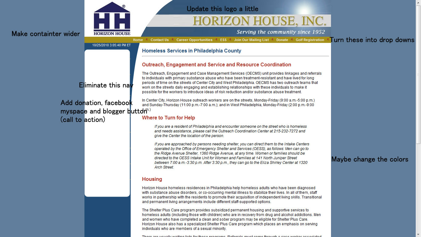
I justify this by saying that the site look a little old school. Like the design looks old, that why I said wI would redo or change the top banner so that it would look a little nice or more hip or something. I would kill the side nav and turn the top into a drop down nav or make the side a drop down and kill the top nav, either way limit it to one nav. I would change the colors around and add a few more graphics for ascetic value since the site is a little plain. Since it seems to be a non profit, I would add a big or previlant donate button and some call to action buttons to help spread the name. I would also make the container a little wider since it seems a little small to me.
The end.
Wednesday, October 20, 2010
Assignment 13
Website:http://www.myfoxphilly.com/
I picked this site since I've been watching it since I was in middle school. When my grandma would wake me up for school she would always watch this station while I got ready to leave. I've been watching it since. Now that I'm older, I'm hearing reports of Fox being like Biased. I couldn't tell but I though it would be interesting if I picked it since I heard a few things about it being like the most biased station around.
From what I can see I don't see much political affiliation just by looking at the index. I'm not quite sure. ON thing that I think I noticed is on the front page, when they have new on Obama, the usually pick an unflattering photo of him to use. I heard a lot of things about how Fox is like supper conservative and that republicans love them but I haven't been able to see anything in the many years that I've watched the news on this station to really prove that. When Obama won the presidential election it seemed like everyone was genuinely happy for his victory, and the website had like "victory for obama" and there were like 3 or 4 stories on it.
I don't think I can find much that sets this site apart from other news site. The only think I could think of that's remotely close to that is that its seems a to focus on like bad news? I guess? Like they could show some "uplifting" stuff? But that's all I could really think of.
Sunday, October 17, 2010
Podcast 7- Stop Using Stock Photography Clichés
Found here: http://boagworld.com/design/stock-photography
This post was about the use of images on a website. The author gave different examples of how to use different types of images to take the place of stock images, since stock images are so plain and like they said in the title; cliché.
There are other options that one could use like illustrations or your own photography.
Wednesday, October 6, 2010

Tuesday, October 5, 2010
Project 2- Phase 1
I'll be redoing index page for the Asian Art Initiative. The website as it stands is pretty cool. I'm only going to making a few changes, nothing to big, but I'm hoping it will look different. I'm to change the lay out of the page a little, and replace the header. I'm going to add better call to action buttons and make it easier to find information.
www.asianartsinitiative.org
I'm also going to try to make the donation button a little better. I've noticed on most non profit sites that the donation button is is pretty prevalent.I'm going to try to give the site a color scheme or a theme. Something like that. I want it to look profession but artsy.
Sunday, October 3, 2010
Podcast 5- Inspired Focus
Found here: http://boagworld.com/design/inspired-focused
This is about how to expand your learning horizons in web design. They talk about how it's better to learn more about something you don't already know of. They talked about a few different methods to memorize and apply the new things that you'd learn. The main way they highlighted was somehow condensing what you learn and like having notes that you can access at any time. One dude use a deck of cards. 52 cards each with a different skill or tactic on it. Whenever he started a new project he'd pick a random card with an idea on it and implement it in his design. I think that's kinda cool. Probably not something I'd do but smart none the less.
Okay, I know this posting is bullshit and not very well put together, but I actually do have a reason today. I'm going through a lot of personal problems. I know it's not supposed to affect my work or whatever but it is. I'm not asking your to like grade me on a curve or anything but, I'm just letting you know.
Monday, September 27, 2010
Assignment 7
Can be found here. It's not late, I just forgot to post it to my blog. You can check the date created on either the files or the archive.
Assignment 6
Can be found here. It's not late, I just forgot to post it to my blog. You can check the date created on either the files or the archive.
Sunday, September 26, 2010
Podcast 4- Calling BS on Perfectionism.
Found here: http://boagworld.com/design/perfectionism
This is a short blog post about perfection and web design. The writer in this post is angry about the idea of perfectionism when is comes to websites. He thinks that there people who are going for perfection are arrogant, since their idea of perfection is different than the next guy or the owner/ consumer of the website. The author uses and follows the pragmatic approach and tries to make sense of their resources and a more down to earth approach.
What I got out of this was just to highly consider your budget, audience, and other specifics. Thinking about perfectionism will just make thinks complicated or blow them out of proportion.
Monday, September 20, 2010
Assignment 5- CCS Block | Inline
Inline CSS code is when lines only take up as much space as they actually need. There is no wasted space.
Block CSS cod is when new lines appear before and after an element, consuming the full width available.
I'm not too sure if I understand this concept too much.
You would use block coding when doing paragraphs with pictures and what not and you would use inline coding. I can't really give other examples since I don't really understand it too much... I feel as though you should teach us a little more instead of throwing new concepts at us.
Heres what I came up with with :

The end.
Sunday, September 19, 2010
BITEme is back up ^_^
I don't know what happened but BITEme.webfreehosting.net was down for a few hours. Whatever the issue was, it's be resolved and everything's back to normal. Don't be afraid to show your joy haha.
Wednesday, September 15, 2010
Temporary Website Up
For whatever reason, WebFreeHosting.net is down and not giving letting me know when it might be back up. Just my luck =_='' But whatever the new site is http://www.saywhat.zxq.net/
I'll be using that until my issue with BITEme is resolved.
Assignment 4- Design Sponge
I like this blog because it looks really warm and inviting. I like the font choice and colors because they all seem to fit together. I like that the design of the blog itself looks like it was a D.I.Y. project with the doilies and ribbons and stuff. I think that fits really well. I like the way the pictures are in the blog post and how the author uses thumbnail to show the step by step instructions on how to make certain things. I like the mesh pattern that's used as the background. I like the brightness of the colors and the sections for the archives and the side menu. FOr its category I the the blog is very well constructed and everything fits and works well together with out making it look too plain.
Sunday, September 12, 2010
Podcast 2- Playful Design
http://boagworld.com/design/playful
This podcast was about playful design and creative ways to design the user interface to make a better user experience and so that one interface can fit many different people and how to make the user experience less frustrating and more enjoyable. A quote that I found to be interesting was "We’re actually designing experiences that affect how happy people are on a daily basis ..." I thought that was interesting. I didn't think designers and engineers took things so seriously. The thing is when I think about it, it makes a lot of sense because that is true. People visit various websites on the daily for different reason, and the interesting between the user and the interface can indeed affect the users mood. Last thing a designer wants is to make something that pisses people off when they use it. This was switching back and forth between the idea of a playful/ enjoyable design and the idea of emotional design. There was this one part were they were talking about a test run for this pet charity thingy and the design they used was supposed to make people feel sorry for the animals or something I guess, anyway they used like a sad looking puppy or something and the first person to look at it started crying because it made her think of her dead pet. I thought that was kinda interesting. I mean, that's a lot of emotion O_O. One of the guest compares the interface design to learning a musical instrument. I didn't really get that too much, but the way they explained it was they want the interface to be something that the user "co-creates" so that they have their fair share in expressing themselves and catering it to themselves BUT also have game like element so that they don't go overboard and turn the experience into something the designer didn't want or something like that.
All in all I thought this one was okay. A little over my head but I understood some parts and the general idea. I really thought that quote was interesting because like I said, I never thought that way before.
Sunday, September 5, 2010
Podcast 1- Stephen Anderson On Emotional Design
http://boagworld.com/design/emotional-design
I liked this podcast because it discussed the role of psychology in the design process. Stephen Anderson uses is basic psychology to aid the design process. He uses different types of user interactions. He uses a few examples of how companies are using a more interactive interface to draw in interest. He used cellphones as an example. He compared the Motorola and iPhone interface. Anderson was talking about how Motorola use to be top of the line then when the original iPhone came out it how it sorta like revolutionized the user interface. He also talking about how websites are trying to become more like games, by like giving perks like badges or points. Those kind of things appeal to people for some reason. He used farmville and iLike as examples on how they use psychological principles like possession in the design of websites. I thought that was really cool.
Friday, September 3, 2010
Project 1- Phase 1
I'm gonna redo this website: http://www.georgiew.de/.
This "client" wants a more minimal index page that showcases their work a little better.
I will be basing it off of the common elements that I found on these websites.
I noticed on theses websites that the index page had a HUGE piece of the authors work. There was a nav bar at the top or the bottom. The text was pretty small and minimal use of text. I saw common links to a blog and different categories of photos. The background image was a slide show and EXTREMELY high quality. So yeah... that's my research.
Wednesday, September 1, 2010
BITEme IS LIVE! Sorta...
Firstly... My thoughts on Google Docs:
I like it. I love it. I've been using it since high school. To me (since I'm logged it) the interface looks like an Email inbox. When not logged in and with a clean cache it looks like microsoft word to me. It has the visual cues of the little speech box that's basically saying "Hey! Test out google docs and tell your friends!" also in the work space, the way the text it is hinting that you can edit it and add what you want. The blinking cursor in the work area is telling you that you can type here so that's another visual cue. I think I'm up to three or four now? I think that the fact that it has a formatting bar is also a dead give away that's its interactive. OH and another thing that caught my eye was how it gives you the option of making this demo doc a text doc, drawing, or a spread sheet. That was definitely one of the things that caught my eye. So yeah... I think that's all I can really say about that.
Subscribe to:
Posts (Atom)